Session 2
August 3, 2023
Agenda
- Create histograms using
geom_histogram() - Create bar plots with statistical summaries
- Group bars by variable
geom_boxplot()- Combine plots using the
cowplotpackage - Export your plots with
ggsave()
Resources
Most of what we cover today will be based off of Chapter 3, sections 3.7 - 3.10 in the R4DS textbook.
Learn more about the features that the cowplot packages
has to offer here.
The links under the “articles” dropdown menu are particularly useful,
e.g. this article
on aligning plots.
Read about ggsave() here
(2.1).
Here are some third-party packages that you may find fun to test out to style your own ggplots:
wesandersoncolor palettesRcolorBrewerpalettesLaCroixColoRcolor palettes- This package is on Github only for now (not CRAN), so it has to be installed with the code below before you can load and use it:
    install.packages("devtools")
    devtools::install_github("johannesbjork/LaCroixColoR")
Homework Exercises
The homework exercises for this week are below. Use the same data as last week when working through the exercises.
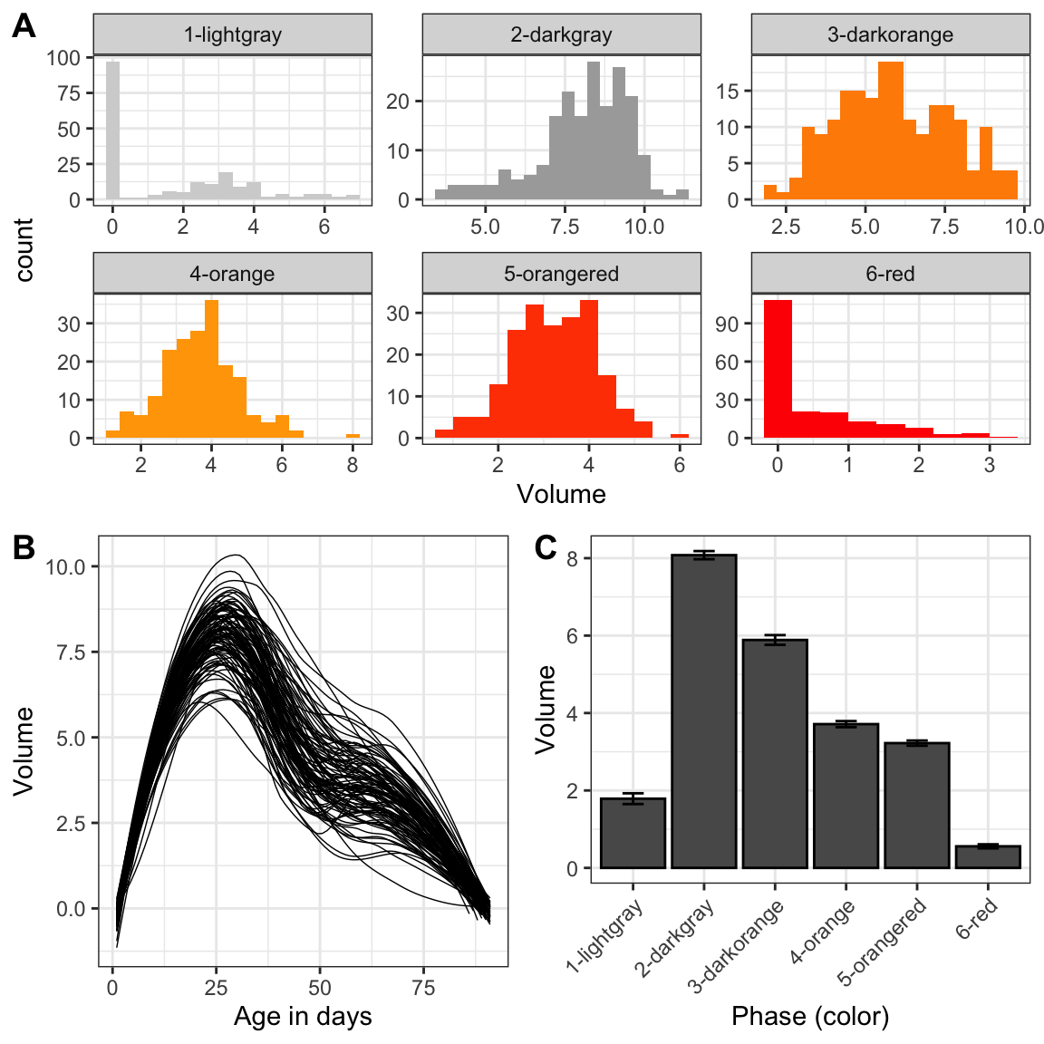
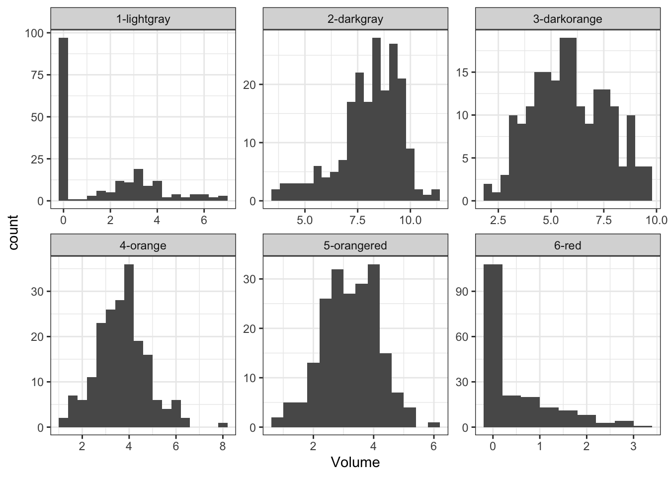
Recreate the R code necessary to generate the following graphs as output using the cowplot package, and specifically plot_grid().
Create a bar plot showing the median cloudbuddy volume for each phase.
How are the following two plots different? Which aesthetic, color or fill, is more useful for changing the color of bars?
ggplot(cb_data,
   aes(x = Observer)) +
  geom_bar(color = "purple")

ggplot(cb_data,
   aes(x = Observer)) +
  geom_bar(fill = "purple")
Recreate the R code necessary to generate the following plot:
What happens if you create a bar plot using
geom_bar()and mapx(and no other aesthetic) to a continuous variable? Think about why the plot looks the ways it does and how it relates to the default behavior ofgeom_bar().Sometimes when creating plots, the axis labels do not quite fit and there is overlap making the text hard to read. There are a few different ways to fix this. Check out this link on how to rotate axis labels and recreate the code to make the plot below. What are the
hjustandvjustoptions used for?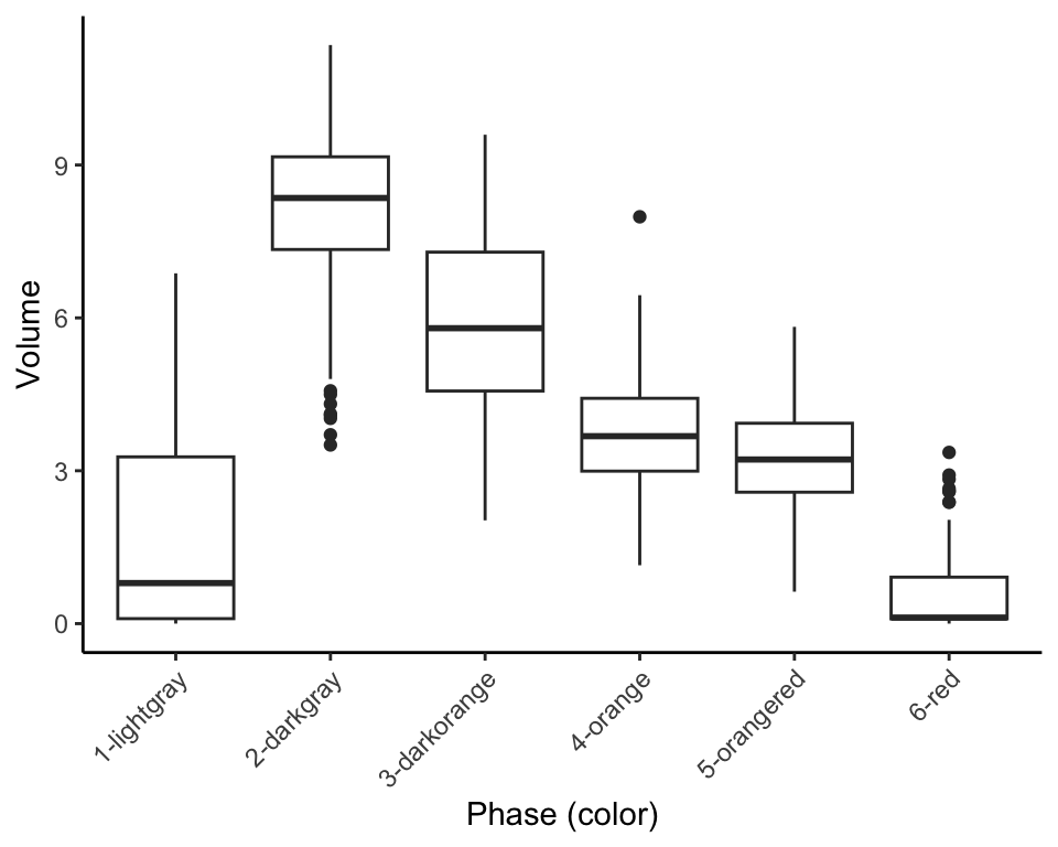
Another option is to change the font size of the axis labels, described here. Use the plot you just created, but without rotated axis labels. Save the plot using
ggsave()and setheight = 3andwidth = 4and adjust the axis label font size until there is no longer any overlap.Pick one of the plots we have created so far and save it (using
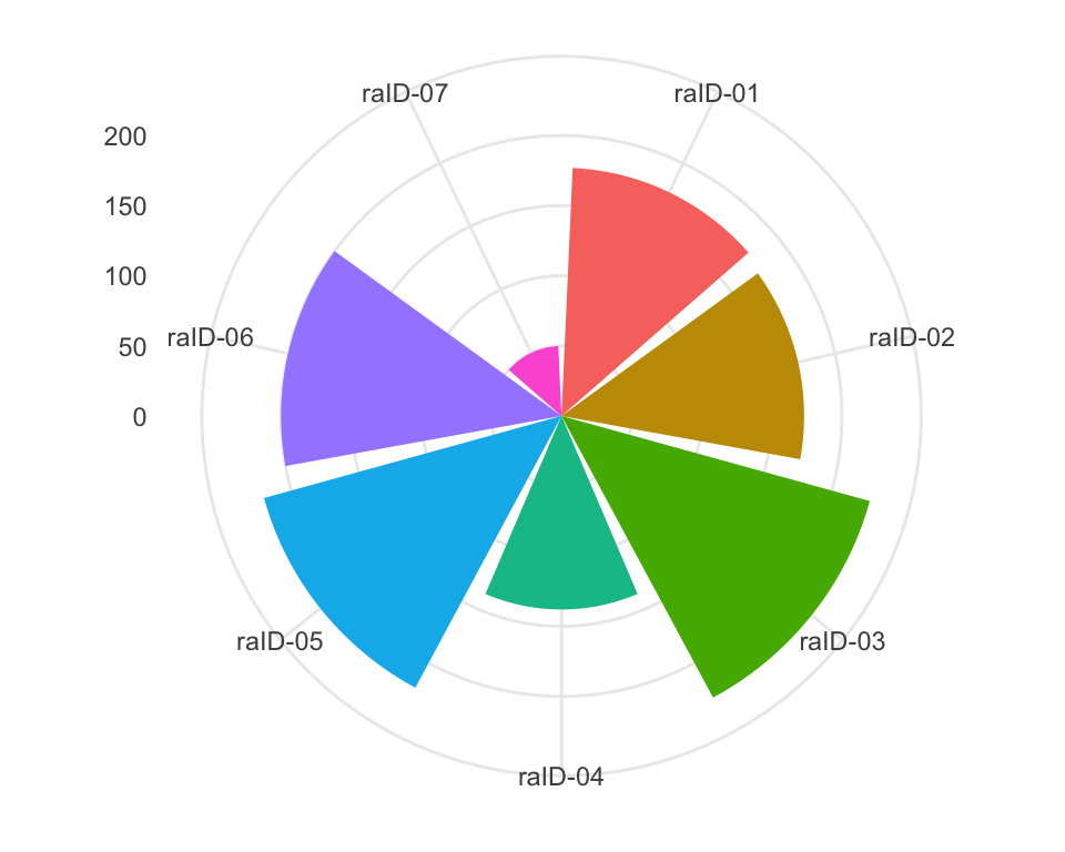
ggsave()) as both a pdf and tiff file (keeping the other settings as default). How does the file size compare between these exported plots? Open the files in an app that lets you zoom and zoom in as much as you can. What do you see? Why is there such a difference between different types of image files (check the resources to find the answer)?Read chapter 3.9 in the R4DS text book and see if you can create a so called Coxcomb chart (which looks a bit like a pie chart; something we will learn about how to make later) like the one below.
What does
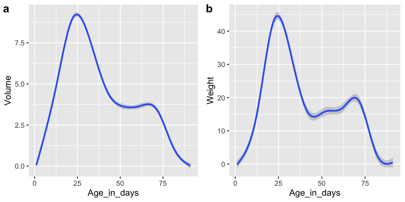
geom_jitter()do? How does it compare togeom_point()? Create two plots, one usinggeom_jitter()and one usinggeom_point()(with for examplex = Age_in_daysandy = Volume) and put them next to each other usingplot_grid()from thecowplotpackage. Are there differences between the plots? Try settingheight = 1ingeom_jitter()and explain what happens.Combine multiple skills that you’ve learned so far (and perhaps a few new things) to recreate the plot below. When setting the histogram colors, remember the name of the aesthetic we use in this case. Read the cowplot documentation to figure out how to combine a plot with facets and plots without.