Session 1
July 27, 2023
Agenda
- Importing data from an Excel file
- Introducing
ggplot2to create data visualizations - Mapping variables to aesthetics
- Facets
- Adding multiple geoms to the same plot
Script
Here’s the script from Session 1. You can download this and save it inside the R Project folder that you created for the class.
Download session_01.RCheatsheets
Resources
A nice review of the RStudio IDE and R Projects: https://www.youtube.com/watch?v=kfcX5DEMAp4
The data visualization methods we will cover today is based off of Chapter 3 (sections 3.1 - 3.6) in the R4DS textbook: https://r4ds.had.co.nz/data-visualisation.html
Homework Exercises
The homework exercises for this week are below. I suggest that you create a new R script to work through the answers, and save your exercises script in your RStudio Project for the class.
You’ll first need to read in the data the way that we showed during
the live session, and call it cb_data.
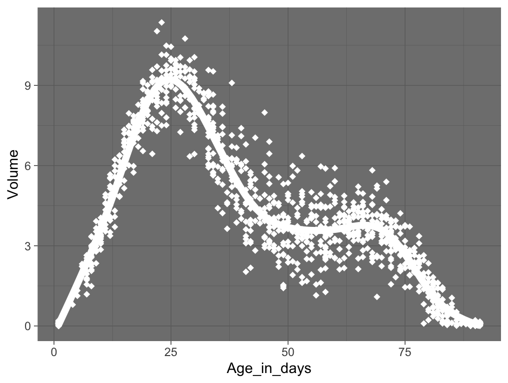
Create a scatter plot using
cb_data, showing the relationship between the variablesAge_in_daysandVolume.Recreate the R code necessary to generate the following graph:
In our Cloudbuddy data there are measurements of both Weight and Volume. It is reasonable to assume that there is a strong relationship between these two variables. Start with the scatter plot you made in #1 and map
Weightto a few different aesthetics (for examplesize,shapeandcolor). Which aesthetic best captures the relationship betweenWeightandVolumeover time?In exercise 3,
Weight, a continuous variable, was mapped to different aesthetics. Now try mappingPhase (color), a categorical variable, to the same aesthetics you tried in #3. Do these aesthetics behave differently for continuous vs. categorical variables?What’s gone wrong with this code? Why are the points not blue?
ggplot(data = cb_data,
       mapping = aes(x = Age_in_days,
                     y = Volume,
                     color = "blue")) +
  geom_point()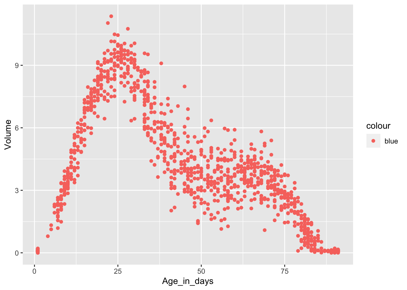
What happens if you map an aesthetic to something other than just a variable name, like
aes(color = Observer == "raID-02")? Note, you’ll also need to specify x and y, and addgeom_point().Run
?labs, read the help page and see if you can recreate the plot below. Note thatlabscan be used to remove labels as well as adding them. Bonus points if you can figure out how to add the superscript in y-axis label.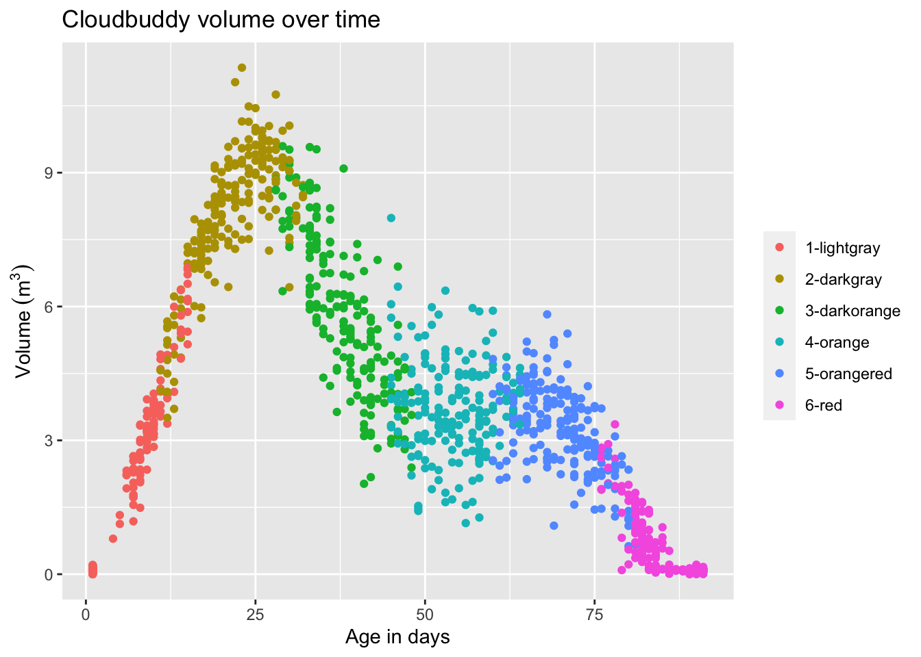
The default
ggplot2settings create plots with a characteristic grey background. This does not align with everybody’s preference (Hasse for example hates it). Luckily, changing the overall look of a plot is easy. Take a look at this link, read about how to change complete themes and try a few themes (using any plot creating code from previous exercises).Some themes are not great when working with facets. Why?
Could you not find a theme you like? Would you like more options? Here is a link with info about the
ggthemespackage, which after you install it (usinginstall.packages("ggthemes")) gives you many more themes (and other options to customize the look of plots made withggplot2).What does the
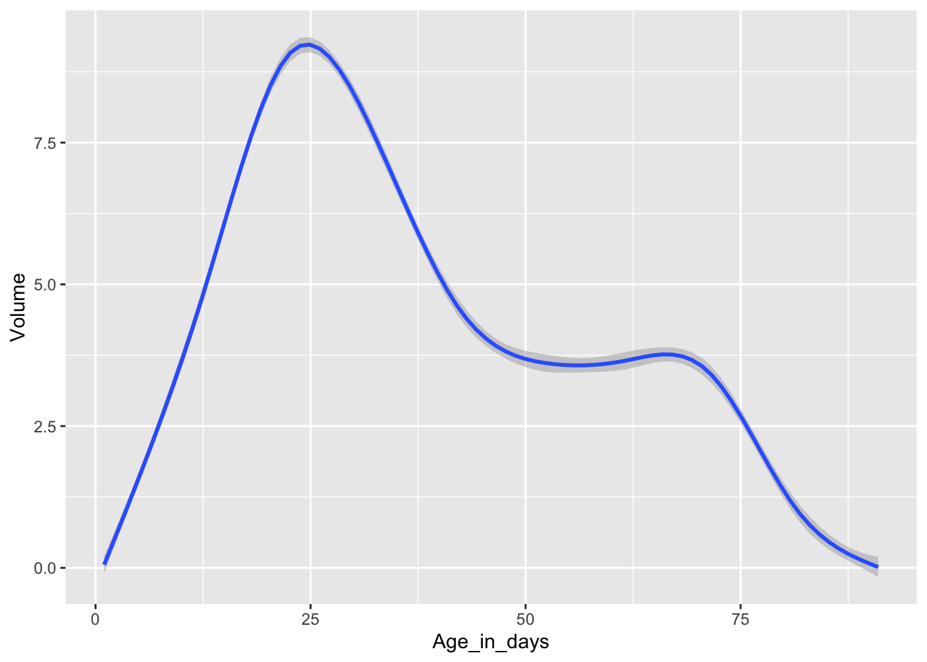
group =aesthetic do? Run the code below and explain what you see.What does
se = FALSEingeom_smoothdo? What happens if you set it to TRUE in this case?ggplot(data = cb_data, aes(x = Age_in_days, y = Volume)) + geom_smooth(aes(group = Cloudbuddy), se = FALSE, linewidth = 0.2)Do your best to recreate the plot below. Check out this link to figure out how to fit a straight line to the data using
geom_smooth(instead of the wiggly trajectories we have seen this geom produce so far).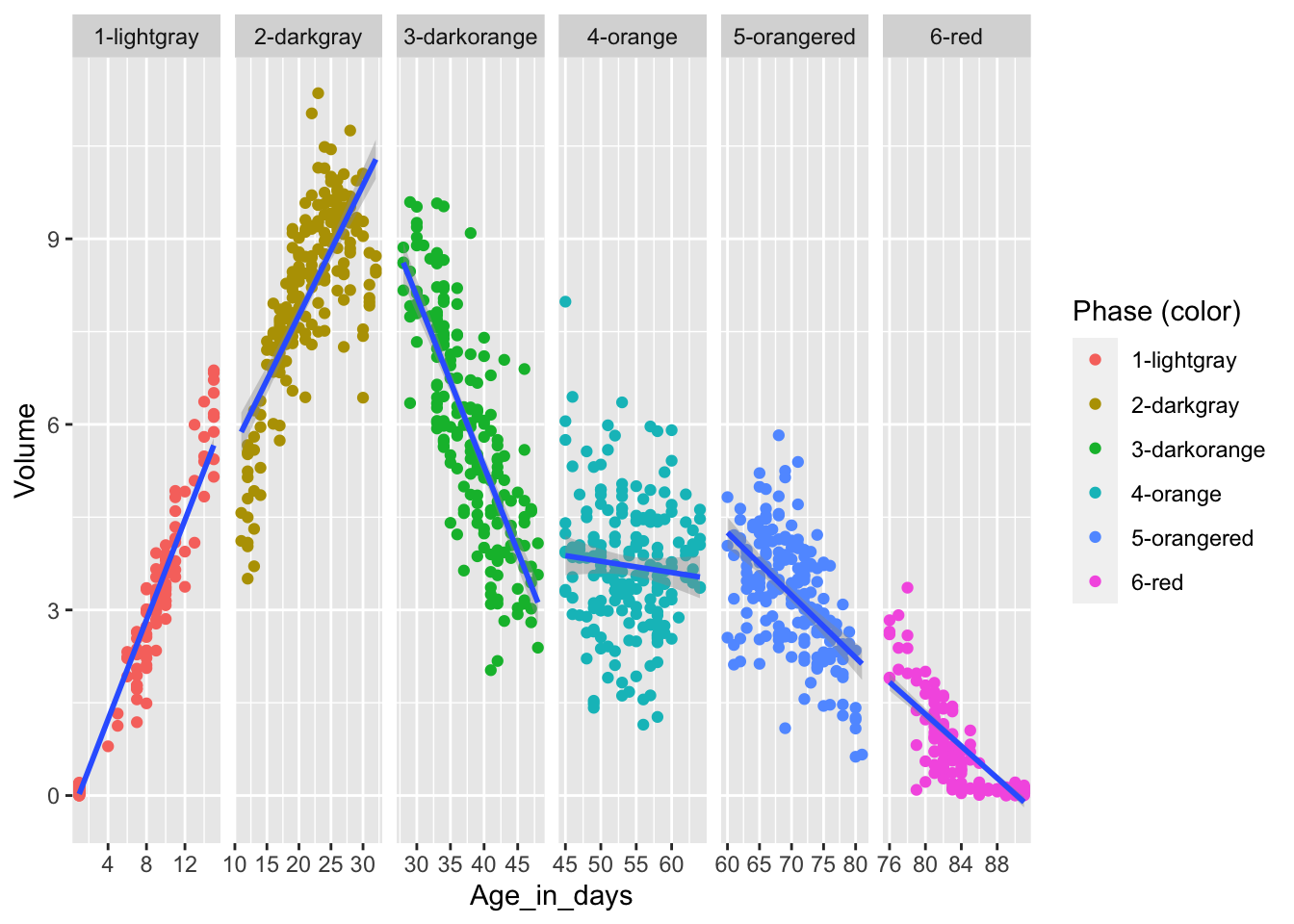
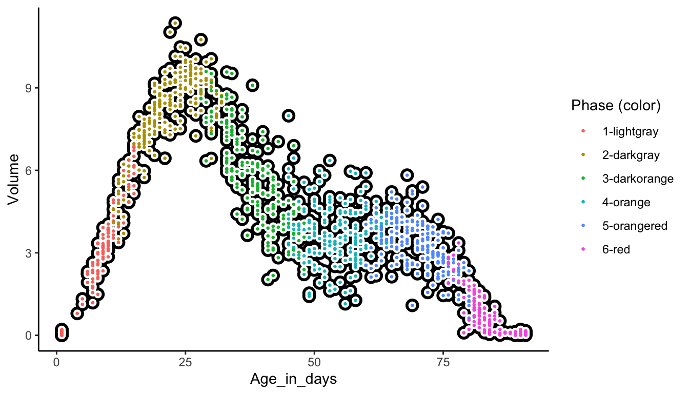
Assign the “correct” colors to the
Phase (color)variable in a scatter plot wherex = Age_in_daysandy = Volume(meaning that the dots in the scatter plot representing for example1-lightgrayshould have the color"lightgray"and so forth). Take a look at this link (Example 2) to figure out how to manually change the default color scheme.Run
?scale_color_manualin the R console. What happens? Find the paper talking about color vision deficiencies (and read it if you are interested). There is a color scheme in theggthemespackage made speficically with color vision deficiencies in mind. Can you find it in theggthemesdocumentation?What does the
c()function do?After changing the colors in the exercise above, the color legend (the list of colors to the right of plot panel, sometimes also called the color guide) is a bit redundant. Can you figure out how to remove it? Google will be your friend here, and good search terms could be ggplot2, color legend and remove.
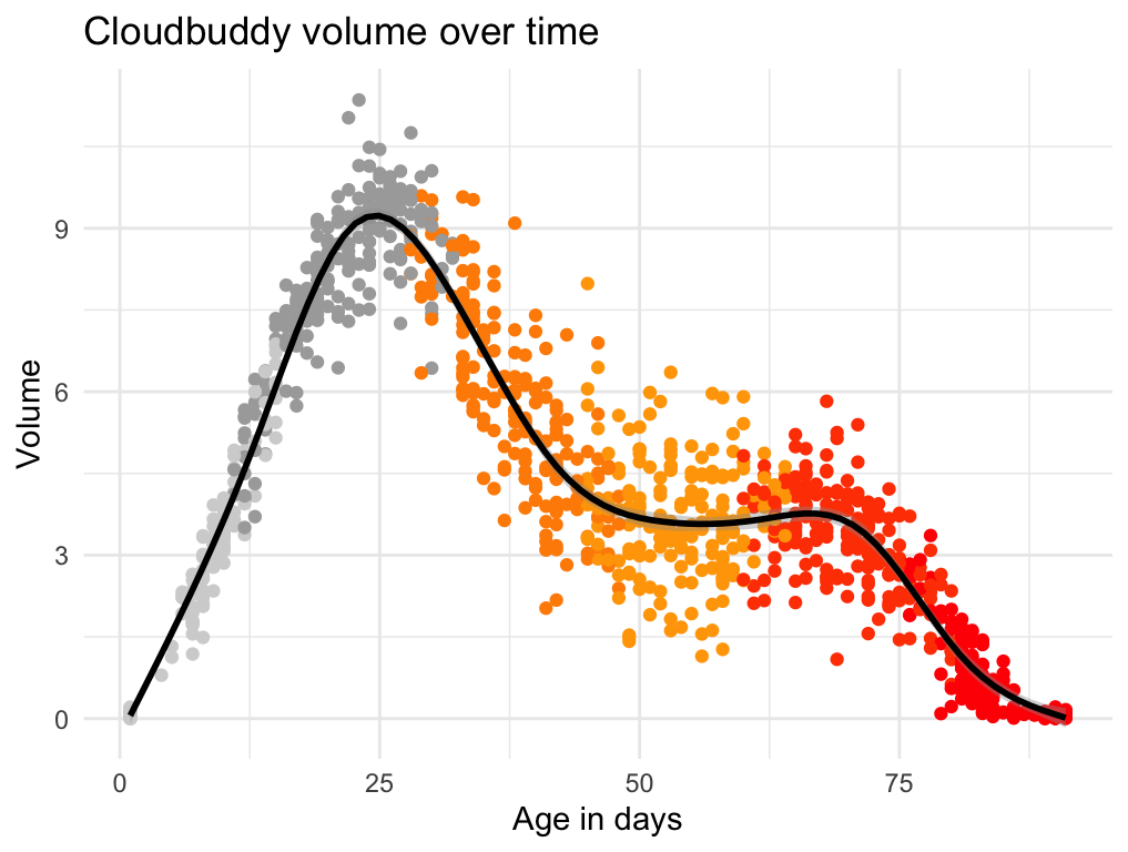
Recreate the R code necessary to generate the following graphs.